When I joined Vistoria, this AI-native web-based writing tool for novelists had no existing design to build on. Partnering with researchers and engineers, I ran stakeholder interviews and competitor analysis to surface a core tension: writers didn't want AI to take over their story, they needed it to externalize their thinking without breaking their creative flow. By the end of the project, what began as a scattered multimodal concept became a structured Canvas and Cluster system, reducing writers' context-switching by 40% and lifting Cognitive Offloading scores by 35%.
CategoriesB2B, Web App, AI Creative Writing ToolDateMay 2025 – Sep 2025RoleLead Designer & ResearcherCompanyCity University of Hong Kong
Solution
Feature 1. Live Multimodal Edit and Sync
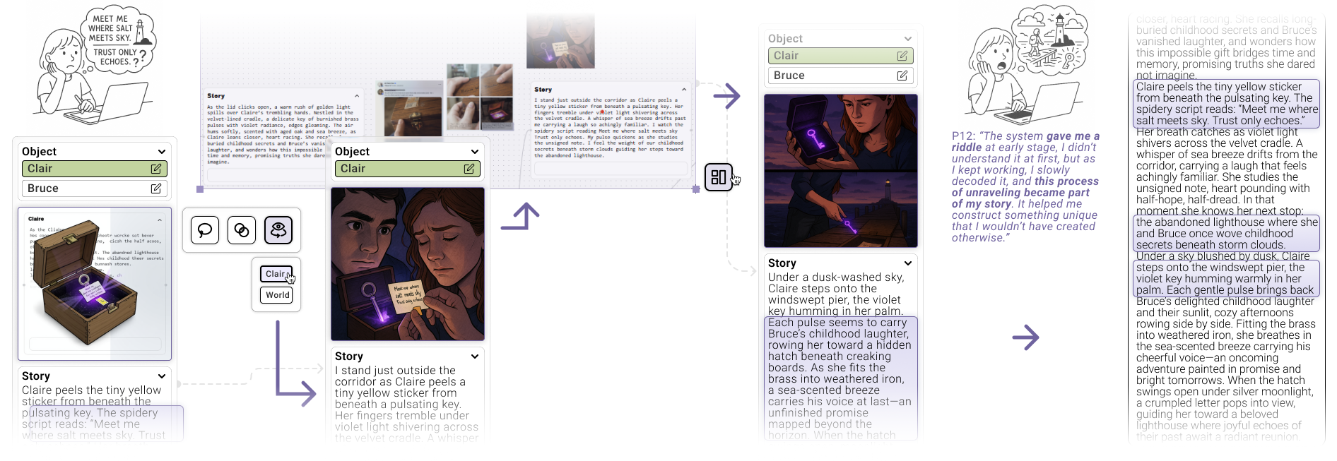
Users can input hand-drawn sketches, text, and reference images simultaneously on the same canvas; the system understands ambiguity and emotion. Then, they create precise versions and three-way neighborhood divergence with one click, allowing for instant comparison and selection.
Feature 2. Multimodal Generation
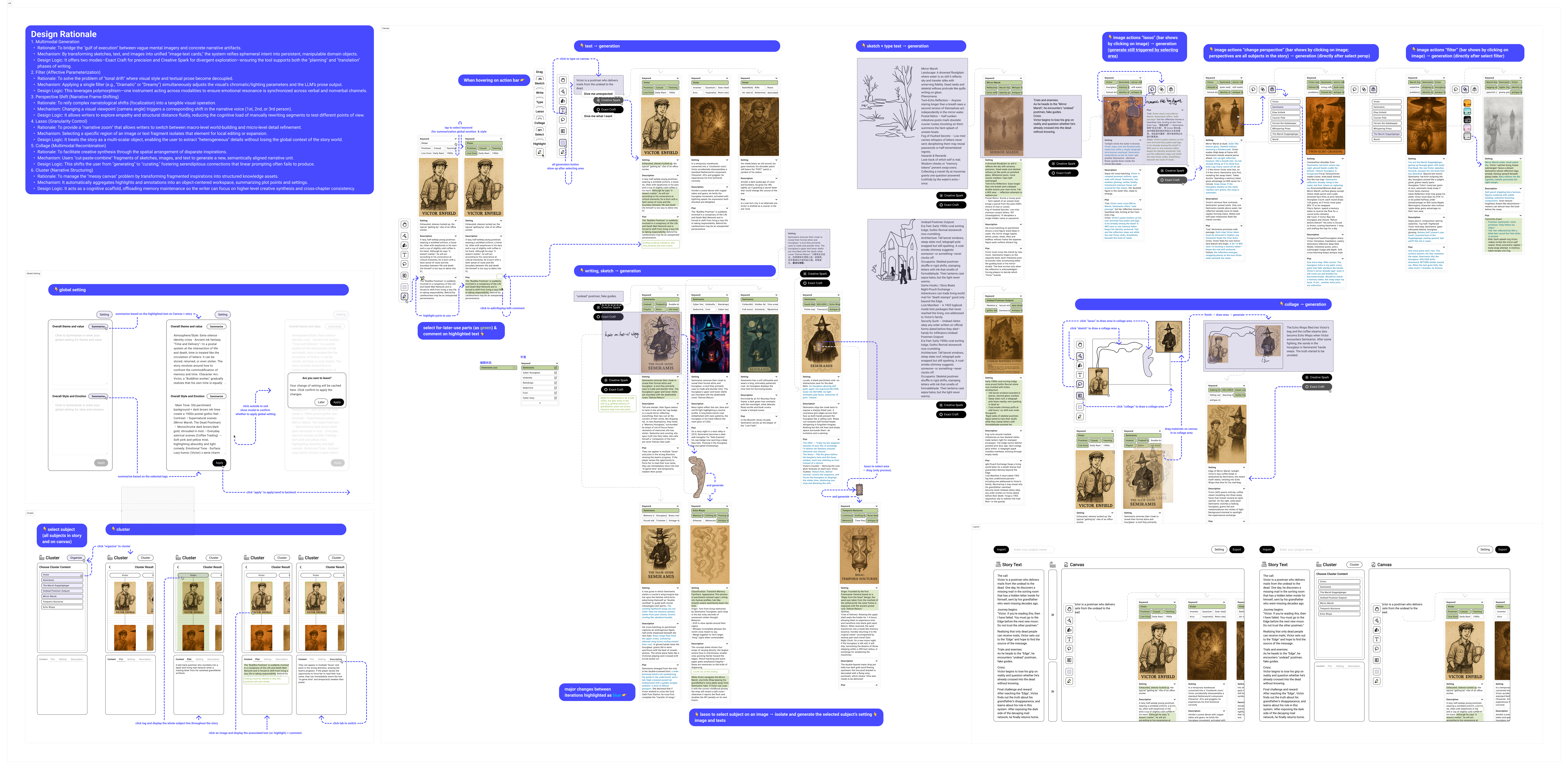
Users can semantically lock text and image, and change one side while the other updates in real time (linking style, tone, and camera language). Lasso for localized deepening, Collage for spatial collage, Filter for style/tone linkage, and Perspective for switching camera position and narrative perspective.
(Collage)
(Filter)
(Change Perspective)
(Extract)
Feature 3. Cluster and Knowledge Base
Cluster scattered cards into a "story skeleton" by character, scene, or theme. Export a storyboard, script, and shot list with one click..
Not Louder. More Grounded.
The pushback came fast. The engineers wanted to simplify. And for a moment, I understood why, but I also knew exactly what would get lost if we let that happen.
Midway through the project, the engineering team pushed back on the interaction complexity I'd designed. Their instinct was practical: reduce it, ship faster, make it easier to build. What frustrated me wasn't the pushback itself, it was that the shortcut they were proposing would have quietly erased something we'd learned directly from writers. So instead of defending the design, I went back to the research. I pulled out interview findings. I referenced the patterns we'd observed. I built the case from the ground up, not from my opinion.
That moment clarified something for me. When there's real pressure to simplify, the job isn't to hold your ground louder. It's to make the evidence impossible to ignore. Good design judgment isn't about being right. It's about being able to show your work when it matters most.
“
Designing an AI-Native Narrative Tool for Fiction Writers.
”
Results
Top-Tier Academic Validation
Successfully published a research paper at CHI 2026, establishing a novel theoretical framework for AI-assisted narrative that integrates dual coding theory and instrumental interaction.
Quantifiable Cognitive Optimization
Achieved a 40% reduction in context-switching and a 35% increase in Cognitive Offloading scores through the implementation of the Canvas and Cluster system.
Innovation in Multimodal Co-editing
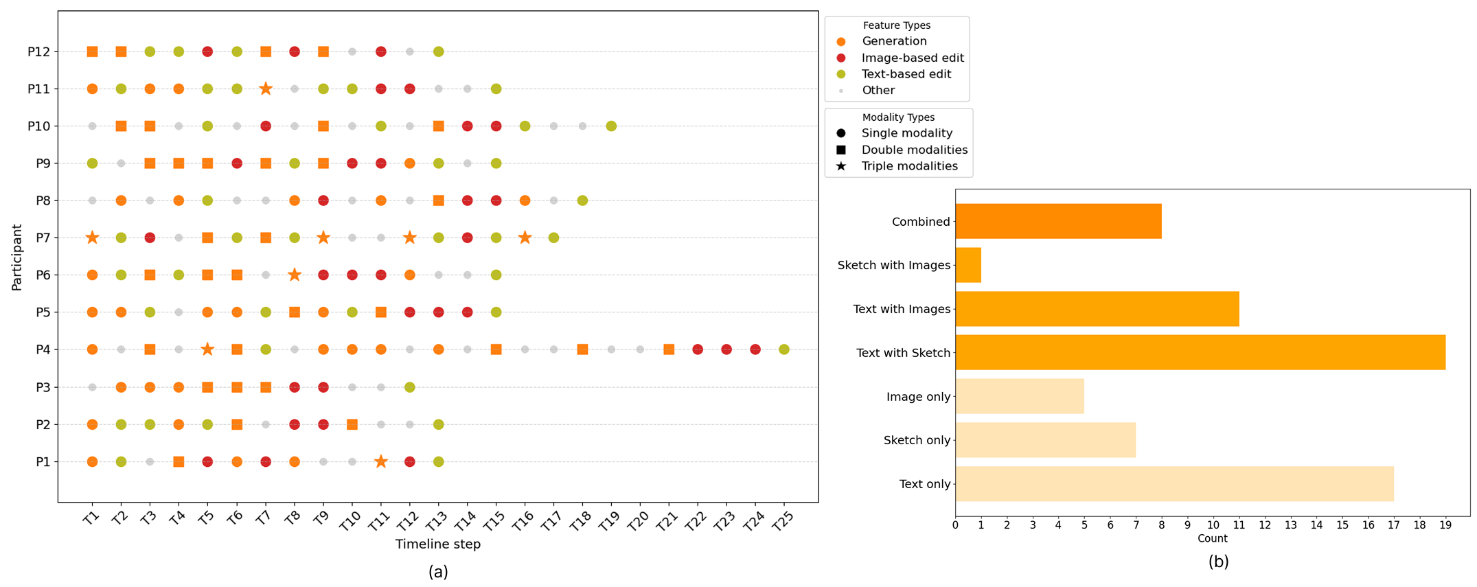
Engineered a node-based interaction model that led to 80% of writers reporting "serendipitous discoveries" during their creative process.
Story
(Discovery, Problem Framing, Stakeholder Interview)
Story 1. Curious enough to research. Sharp enough to reframe.
When this project started, I didn't open a blank canvas. Instead I opened every competing tool I could find. What I discovered wasn't inspiration. It was a pattern: every existing product had quietly agreed that text and image belong in separate workflows. Writing tools made text smarter. Generation tools made images richer. But none had questioned whether that separation was the right premise at all. I stopped there, named the gap, and made it the actual starting point of the design. That reframe shaped everything that came after. Research isn't just collection — it's interrogation.
(Information Architecture,User Flow, User Journey Map)
Story 2. I Don't Pick Sides. I Build the Bridge.
As discovery progressed into design, the team split into two directions: one prioritized innovation through a canvas-first system; the other prioritized usability through a pain-point-driven approach. Neither was wrong, but together they created a deadlock. I didn't pick a side. Instead, I proposed an adjustable panel structure, something writers could resize or collapse depending on where they were in their process. When engineers pushed back on interaction complexity, I didn't defend the design from instinct. I pulled out interview findings and research precedents and built the case from evidence. We reached a consensus.
(Feasibility Assessment, Dev Trade-off Negotiation, Usability Testing)
Story 3. I Don't Trust Handoff. I Engineer It.
Once the direction became clear, I assumed the hardest part was behind us,but it wasn't. During handoff, engineers struggled to understand how the Lasso tool's selection logic connected to the AI's semantic extraction process. One suggested replacing the whole multimodal interaction with a standard chat box. I wrote detailed Interaction Specs: pixel-level annotations, data flow diagrams, and explicit rationale for every decision that might get simplified away. Not because I didn't trust the team — but because I'd learned that intent doesn't survive a handoff on its own. Clarity has to be built into the document itself.